Apple’s News App, Millennial News Sites, Designing for Mobile Ad Viewability, Businessweek’s Coding Issue, Women in Media, TFP’s Infographic Pick of the Week, InDesign CC Tip: Custom Glyph Sets
Welcome to Technology for Publishing’s roundup of news and tips for media industry pros! This week, we’re sharing stories about Apple’s announcement that it’s replacing Newsstand with a Flipboard-style app called News, a millennial’s take on millennial news sites, how ad viewability is playing into mobile site design, an entire Businessweek issue devoted to programming languages, and more.
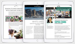
- A big story out of Apple’s WWDC conference this week was that the company is retiring Newsstand, replacing it with a Flipboard-like app called News—a move welcomed by many, given ongoing dissatisfaction with Newsstand, which required custom app development for each publication or adoption of a third-party iOS publishing platform, according to Macworld. With News, expected with the release of iOS 9, publishers will own the content and control the format of articles hosted on the platform and be able to sell ads within the app, much like with the popular Flipboard offering. Several other sites reported on the announcement, including the Guardian, which noted the move is aimed at countering Facebook’s growing influence in the publishing world, most recently with deals to host publishers’ content directly on its platform. For its part, Business Insider highlighted the enhanced mobile reading experience the new app will offer. We’ll keep you posted on rollout developments.
- Yes, everyone in the news business has heard: it’s all about the millennials. Eighty-million-plus potential readers (and buyers of advertisers’ products). Problem is, publishers haven’t been able to figure out the secret formula for grabbing the demographic’s attention—and keeping it. Enter millennial news sites like BuzzFeed and Vice and lesser knowns Mic, Ozy, Vocativ, and Fusion, all of which think they have an edge. But Wired columnist Julia Greenberg, a millennial herself, argues enough with the niche sites already. In an enlightening post, she says that while these upstart publishers do offer content that’s appealing to her age group, really all anyone wants—millennials included—is good stories. Easily accessible by phone, that is.
- Mobile ad viewability is now a big factor in the design of publishers’ mobile sites, Digiday reported, noting that while there isn’t yet an official standard, many media outlets are trying to get out in front of the issue as more than half of their traffic now comes in from mobile devices. It said many are opting to place their ads high up on pages where there’s no question they’ll be easily seen, while a few, like Forbes, are placing them further down in story paragraphs. Still others, Quartz included, place them between articles in a continuous scroll. Really though, at this point, “it’s like throwing spaghetti against the wall,” said one design firm CEO. Since current viewability standards are based on desktop, not mobile, publishers are still experimenting with different models to figure out what works best.
- Here’s a crazy idea: devote an entire double issue of a top business magazine to…computer coding? That’s exactly what Bloomberg’s doing with its upcoming 112-page Businessweek issue, featuring a 38,000-word piece on programming languages such as Java, C++, and Python with the goal of making coding more accessible—something that could be particularly helpful to publishing teams operating in the digital world. Editor Josh Tyrangiel told the Guardian that the idea surfaced because software is now part of virtually everyone’s life but there’s still widespread ignorance about coding. “It’s no longer acceptable to be ignorant about the ways it works,” he said. “Software is a completely different discipline, and we wanted to help demystify it for the world that doesn’t think that way.”
- On the Technology for Publishing blog: Our latest Women in Media roundup highlights a Q&A with news veterans Cokie Roberts and Lesley Stahl, how colleges are trying to recruit more women into their tech programs, a new report on gender equality in the media industry, and more.
- While there’s been a lot of hype around Periscope and rival Meerkat, who’s really using the live-streaming apps and what for? See our Infographic Pick of the Week to find out.
- Also check out this week’s InDesign CC Tip to learn how to set up a custom glyph set that can be shared with other users.
Image: Macworld
Check out our blog for highlights of interesting and noteworthy stories from the publishing world every Friday, and sign up for TFP’s This Week in Publishing newsletter. Think we missed something great? Let us know! Leave a comment below or drop us a note.
Posted by: Monica Sambataro


