Once again a new release of InDesign (v2017.1) focuses on the user interface. As frustrating as this may be to those users who are looking to be “wowed” by fancy new features, these changes are being made as our workflows continue to change—maintaining a consistent look and feel across multiple applications, using multiple types of devices, which is the core of the Create Cloud environment.
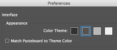
InDesign’s user interface is “flat, modern, and easy on the eyes,” and again brings more consistency with the UI of other Adobe apps. Every button, tool, and panel has been redesigned, and the interface now has four color options to choose from: Dark, Medium Dark, Medium Light, and Light. Adobe has changed the look of the interface again with the intent of delivering an “optimal user experience.”
Check out our handbook, Using Adobe InDesign CC 2017, for more features!
For weekly tips and updates on Adobe Experience Manager Mobile and InDesign, check out our blog and sign up for our newsletters. Want to learn even more and become an InDesign or AEM Mobile expert? Check out all our best-selling handbooks and apps.
Note: Information contained in this post is current at the time of posting. Visit the Technology for Publishing News & Events blog for the latest info on Adobe software releases and functionality.
Posted by: Monica Murphy