Digital publishing has been in a tizzy since the release of the new iPad, with Adobe Digital Publishing Suite users scrambling to get accurate information on how to get their content optimized for the new device. Based on feedback from early adopters, and clearer information that’s now coming from Adobe, there are several things DPS publishers can do to make sure their apps work across both new and old devices.
If you plan to stay with the DPS v18 release to create folios, here are several things to consider for optimization:
- Use the PDF option in Folio Builder when uploading folios. This will generate PDF files rather than PNG files for pages. Staying with PNG files may result in text that looks more pixelated on the new iPad.
- Note that the PDF option will NOT work for pages set to smooth scrolling, so consider not using smooth scrolling if you can for the short term, or design pages differently to minimize those pages that will end up as PNGs because of the smooth scrolling option.
- Also note that any overlays that have been created that include type will NOT be converted to PDF and will stay rasterized, so these may be pixelated. Test these to see how they look.
- Pay attention to the Viewer Builder settings that enable PDF Pinch and Zoom, and remember that this option is set in addition to the article-by-article conversion to PDF from the Folio Builder. Some publishers are finding that while they need to convert to PDF for their type to look good across all devices, enabling PDF Pinch and Zoom at the app level also needs to be tested to be sure that allowing users to zoom in on all content produces a desirable result.
If a publisher plans to move to DPS v19, learning to create and manage the renditions for iPad 1/2 separately from the rendition for iPad 3 is key to success.
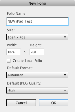
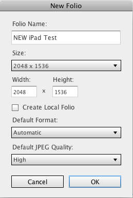
Per our previous blog post outlining the features of v19, from a single document you’ll want to create two sets of folios to optimize for all devices, one at 1024, and one at 2048. You have the option to do this when you upload from the Folio Builder. Adobe’s hosting server will deliver the appropriate-resolution content based on the device that’s doing the downloading.
Here are some suggestions to expedite the design and production processes:
- Create one set of files designed in the 2048 OR 1024 size. Then use the Folio Builder to designate the target folio size, and it will create the rendition, scaling it to the proper size. If you are new to InDesign and would like some suggestions for how to do this, drop us a comment below.
- Remember that for static images, DPS downsamples placed images when rendered to the target device resolution. This can work to your advantage: Place images at the resolution that’s optimal for the iPad 3 (HD), and they will be appropriately downsampled for iPad 1/2.
- For interactive assets, plan to create versions for both resolutions. Auto-conversion to PDF won’t work for interactive content because it’s literally an overlay to the PDF’d page, so images and text will be rasterized to PNG. You’ll want this to be as hi-res as possible for best results. Utilize layers for this process to differentiate assets intended for 2048 folios versus 1024 folios, and then show or hide those layers when uploading folios—it will help expedite the production process.
The information on all of this continues to evolve. The bottom line is to test all of your content to see how it will behave. Every publisher’s combination of text, fonts, images, and interactive content may look better or worse, so testing to see what the user experience will be, and how different your content will truly look, are your best bet.
For more DPS tips, take a look at our DPSCreate™ handbook and iPad app.
Posted by: Margot Knorr Mancini


