On March 30, Facebook officially rolled out Timeline, the new format for profiles and pages, to all brand pages. Some brands were ready to go by the deadline, having put a lot of thought and effort into how to best utilize the new features and updated format offered by Timeline, while others are now in the position of playing catch-up.
Social media has become an increasingly important part of the content distribution model for publishers, and Facebook is undoubtedly part of this strategy, so we decided to take a look at how major publishers are handling the switch to Timeline and how they’re leveraging the new format.
Here are some of the magazines whose Facebook Timelines stood out:
National Geographic Magazine
One of the ideological forces behind Timeline for brand pages was the desire for brands to to be able to tell more authentic and engaging stories. Timeline’s Milestone feature, which allows organizations to highlight important events in their history, stands to play an important role in helping magazines tell the story of their brands.
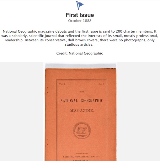
National Geographic has a long and rich history, and its use of the Milestone feature offers a perfect example of how to create a more authentic and engaging story for Facebook followers. Its Timeline starts with the launch of its first issue, in October 1888, and shares highlights from every decade up to the present.
Backpacker Magazine
When Timeline rolled out, the tabs on brand pages, previously located on the left sidebar, were relocated to the applications section, below the cover image.
The applications section is an important piece of real estate on the Facebook profile that shouldn’t be ignored. Backpacker magazine does a great job utilizing this space to direct users to its iPad editions, free GPS app, and its newsletter subscription form.
Beyond creating a page with engaging content in the Timeline, it’s important to use the available real estate to show users what other ways they can interact with your publication (Twitter, digital edition subscriptions, blog RSS) or to promote the value-added features that are available (Facebook apps, iPhone/iPad apps, free newsletters).
Martha Stewart Living
While the use of images in Facebook posts was possible before Timeline, publishers are now able to emphasize their photographs even more with the Highlight feature. When a post is marked as highlighted, it expands to take up the full width of the page, rather than the usual half-page.
Martha Stewart Living is known for its use of beautiful, eye-catching photography, and its Timeline echos that aesthetic. Leveraging its extensive collection of images, the magazine drives interest in its recipes and DIY articles by creating topic-centric photo albums and providing links to website content. The impact of the striking images that accompany those links is amplified by smart use of the Highlight feature.
The Atlantic
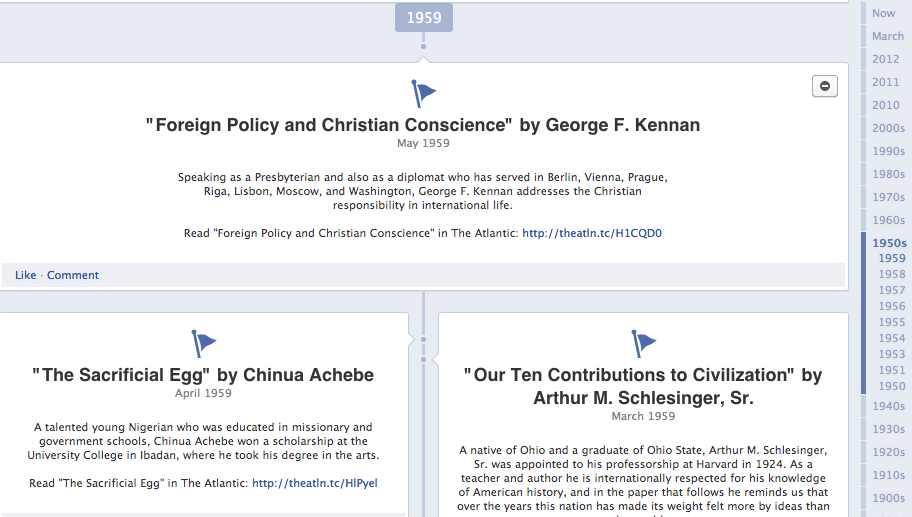
While the National Geographic Timeline uses the Milestone feature to tell the story of its brand, The Atlantic takes a different approach. Instead of focusing solely on providing users with a history of the company, The Atlantic chose to add links to all of the stories in its archives, dating back to 1857. This content-focused Milestone approach differs from that of many other publishers but may work to drive interest in previously published content that otherwise might receive little attention.
It remains to be seen which approach will be more effective in engaging users and driving traffic, but as is the case with new iterations of social media, it’s important to think outside the box and take chances to learn what works.
Have you seen any creative, or particularly interesting applications of Facebook’s new Timeline? Share your thoughts in the comments or on the TFP Facebook page.
Posted by: tfpadmin


