Yesterday, Adobe reviewed its latest release of its Digital Publishing Suite, Version 28, which incorporates a number of major enhancements, including critical updates to align the product with Apple’s latest iOS release, iOS 7—also expected to be released this week. The update includes a number of new features or improvements specific to the library view, sharing, analytics, and performance.
iOS 7
- IMPORTANT: Version 28 of DPS has been released to align with Apple’s iOS 7. With this update, DPS will longer be compatible with iOS 5 or the iPad 1, so it’s critical that DPS publishers understand their subscribers and what devices they are on. Adobe recommends that publishers who need to continue to support iOS 5 publish v27 updates until the publisher is ready to implement v28. Check out this TECHNICAL BRIEF to help guide your decision-making process around this update. To be clear, v28 runs with iOS 7 and iOS6. v27 and previous viewers run with iOS6 and iOS5.
- Adobe does not recommended staying on Viewer versions older than v27 for stability reasons in iOS.
- Changes to the standard user interface elements of iOS 7 have led to corresponding changes in the DPS Viewer in order to maintain compatibility, including the use of lighter-colored icons and text. The change in iOS 7 background color from black (iOS 6) to gray in the publication’s store pages will affect any customization publishers may have built, so they will need to determine whether changes are needed.
- Another change to the UI is increased space between icons; the spacing will adjust automatically based on the number of icons. Note that the OS does not truncate the label below an icon, so label text should be a maximum of 10-13 characters.
- The bottom navigation bar is wider in Folio View for both iPad and iPod. This change aligns with Apple’s design guidelines but will affect an app’s available display area.
- In addition, v28 apps will display Apple’s 20px status bar at the top of the screen, on iPhones and iPads on both iOS 7 and iOS 6. The top navigation bar drops down a bit to allow for the standard iPad bar for network, time, and battery to appear above the nav.
- Instead of having to provide three custom icons for the bottom navigation bar—Up, Down and Disabled—you can provide a single, monochromatic icon and the OS will automatically display the appropriate state by changing the icon’s color. Note that icon colors can currently only by blue when active, and cannot be customized.
- iOS 7 requires a change to app icon sizes; you need to create three for v28 and v27 in App Builder: one for iPhone, one for regular iPads, and one for the iPad Mini.
- DPS v28 publishers have the option to lock orientation to landscape or portrait.
New Sharing Features
- Version 28 has adopted the native activity-sharing menu from iOS 7 plus a new sharing feature via AirDrop. Apple’s AirDrop technology lets individuals share content with other Apple users in a limited nearby area. AirDrop provides a “one click to content sharing” experience. A user looks for a user within range, shares an article, the recipient accepts, and they then see the article within the single article viewer in the Mobile Safari Viewer. Fourth-generation iPads, iPad Minis and iPhone 5 are supported.
- Email is now supported in-app so users don’t need to launch a separate email app to share content. They can also pin a page that they’re on within an article to Pinterest.
- Apple will not show Twitter and Facebook icons in the sharing menu unless the user has entered their credentials via the settings, so DPS detects whether the credentials have been entered in the settings, and if not, the user is prompted to enter their account settings to use those social media features.
- A promotional Smart App banner at the top of the article viewer window will encourage that user to install your app, which they can do by clicking on the banner. A second app promotion banner will appear at the bottom of the content. This feature does support a paywall.
- When a page loads on, say, an Android tablet, the iFrame will return to you via the SDK what they were trying to view so that you can redirect the user to where you want on your website.
- There are differences between the mobile article viewer and the web viewer with respect to what functionality is supported. The mobile viewer does not have a TOC or sign-in, and it has fewer overlays. It’s intended to be a promotional vehicle to encourage app sales, rather than to serve as a fully functioning viewer.
Push Notifications
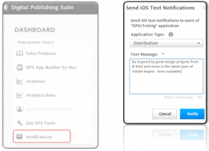
- DPS Publishers can now send text push notification to readers directly via the DPS Dashboard, rather than relying on a third-party service. In the DPS Dashboard, publishers can click on the new Notifications tab, then select a target app and create a text message to send out to readers on their devices.

- When readers click on a notification they have received, it will result in application startup. Publishers can get stats on how many readers have opened their app this way. This works only for apps built on iOS devices.
- NOTE: This feature is something to be sure users are educated about and has some controls and process in place to avoid sending erroneous text notifications to all users.
Analytics
- Additional analytic controls allow DPS publishers to track the popularity of articles (i.e., content views) based on author or advertisers, via SiteCatalyst, to identify those that are generating the most article views within an issue.
- There is a new Analytics Beta in the dashboard. It’s considered a beta because it supports English only and runs only on the latest version of browsers.
- Adobe is working with MPA to standardize audience metrics. There are four metrics available: Accumulated Readers, Accumulated Sessions, Accumulated Time Spent Per Reader, and Accumulated Sessions Per Reader. The publisher can set a time period for which the accumulations should be tracked.
- Data can now be exported in .csv format, a feature that users have been requesting.
Production Infrastructure
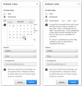
- A new folio scheduling feature is now live. A folio can published as private, and the publisher can then preflight and approve the app, and schedule it to launch later.

- COOL FEATURE! A new camera API allows the device’s camera to be used inside a folio and library so users can take a picture or use one from the photo library to customize their own issue cover, for example. It can be used in multiple instances within a single folio.
- The Folio Producer API is now experiencing a five to 30 times increase in speed; the larger your account, the greater your improvement will be.
- The distribution service is now running on AWS, having been migrated from Adobe’s Data Center. There’s a hard cutoff date of Sept. 30 for shutting down the former data center, so publishers are advised to verify that their data/metadata/folios have migrated successfully before this date. TFP advises that each folio be tested within the app, and that Folio Producer Organizers be reviewed to be sure all items are accounted for and working properly.
Posted by: Margot Knorr Mancini


