One of the best ways to learn how to engage readers with in-app interactivity is to experience as many magazine apps as you can. When you find yourself immersed in a magazine’s content, step back and take note of what grabbed you. It might have been a video or a soundtrack. Or a bit of beautifully executed typography … or maybe a color-drenched image.
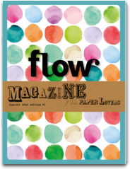
Flow is a magazine “for paper lovers,” produced in the Netherlands. They just recently launched an international version in English and are offering a free digital issue for iPad in the iTunes store and for Android tablets on Google Play.
The Flow designers make creative use of all of the basic interactive DPS options, starting with an animated cover that builds with playful music in the background.
The editor’s letter features a vertical scroll accompanied by old-style typewriter key-tapping sounds. Really retro-sweet.
Within feature articles, callouts are pulled onto the page from the left, overlaying an image of masking tape that creates a clever visual backdrop. It’s a nice, subtle interactive touch that keeps you engaged and reading.
The Flow editors also make great use of visually oriented social media sites, enabled by Adobe DPS. The issue offers a page with live access to their Pinterest boards. You can scroll through the active page and dig deeper into images for detail and sharing. There’s also a live link to their Instagram page with similar options.
One article is actually a short movie. Tap to play, expand to full screen, and suddenly you’re taken to an enchanting love story set in a bookstore. Try to do that in a printed magazine!
Posted by: Mary Lester


