TFP’s DPS Tips offer a vast amount of information about building interactives and folios in InDesign, as well as building and configuring apps and folios in DPS App Builder or Folio Producer. You can find additional information on these topics elsewhere on the Internet too, of course. While there’s obviously plenty to talk about in those areas, today we’d like to touch on something completely different: how to design your app in a way that best utilizes the tablet medium to engage your readers and make them come back for more.
When tablets first hit the market a little over four years ago, software companies were quick to offer a simple solution for porting print publications to digital: PDF replicas. There are still plenty of them out there; they’re a good way to break into the digital market. But given the interactive functionality available through Adobe InDesign and DPS, the PDF replica is a short-lived attempt at making a go in the digital marketplace. The future of digital publications lies in the creative use of interactivity to rethink what a publication can and should be—and what it can offer the reader within a new platform.
There’s a lot to that last sentence, and it involves more than just building fun new interactives using InDesign or HTML. Sure, that’s a big part of it. But the bigger challenge is to get the reader to engage with your app in a completely different way than they would with a print publication. The very best DPS apps we’ve seen entice readers to explore the content of the application by following hyperlinks and unique navigation systems that are fun and interesting unto themselves.
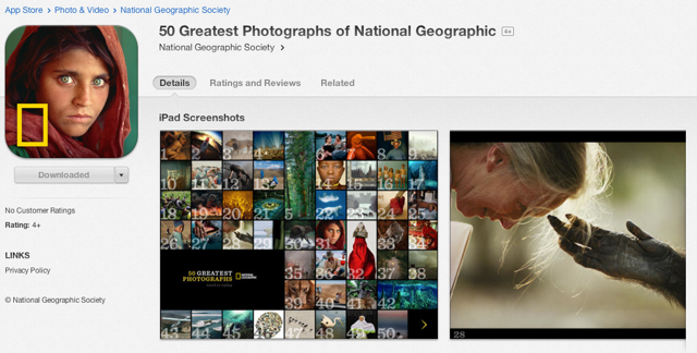
One of my all-time favorite examples is National Geographic’s 50 Greatest Photographs of National Geographic app. It was actually one of the very first apps created with DPS, and it stands as a lasting example of how the tablet medium can be used to get your readers to play with your publication app instead of just flipping through in linear fashion, cover-to-cover. National Geographic breaks this paradigm right on the cover page—a beautiful HTML5 animation that ends in a visual table of contents comprising thumbnail images of the magazine’s 50 favorite images. There’s nothing to read there… just 50 amazing little images begging to be tapped and explored.
Each TOC image serves as a hyperlink to a treasure trove of information about the photograph and photographer. There are stories about how the photo was taken, interviews with the photographer, videos and image sequences describing the challenges the photographer faced, and a little map of the world that shows where the photograph was taken. Tap on the map, and you’re brought to a secondary navigation system—a globe with 50 red-dot hyperlinks so you can dive back into the content based on where an image was taken. Cool—way cool!
I’ve spent a few plane rides weaving in and around all the photos in National Geographic’s app, and I still pick it up from time to time because it’s just fun to play with. This, I believe, is what makes a DPS app great—and it’s the kind of creativity that gets readers to spend hours instead of minutes exploring app content.
Ultimately, it’s the way school kids of tomorrow will read and learn, and it’s an approach that gives readers a reason to go digital. So break the linear paradigm: It’s worth it, and it’s a sure-fire way to set your publication apart from the page-flipper competition.
Posted by: Marketing Manager


