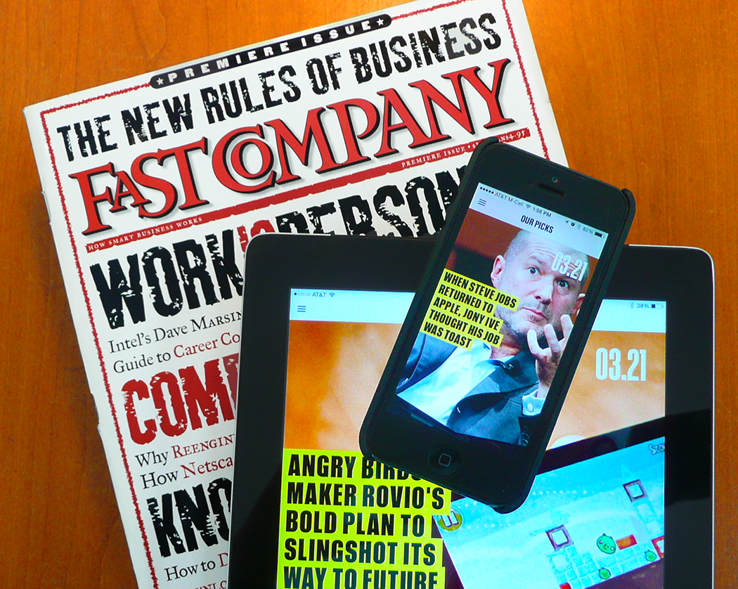
Where were you in October 1995?
I was the design director for CIO magazine, a publication covering business and technology strategy at the executive level. The web was still new to many of us. We had just launched WebMaster magazine to serve executives navigating this new landscape. Amazon was only a year old, and Google did not yet exist.
And in October of that year, I was gaping at my first issue of Fast Company magazine.
It was brashly oversized, hefty, and beautifully designed. On the cover, powerful typography spelled out Fast Company’s manifesto to a youthful workforce: “Work is Personal. Computing is Social. Knowledge is Power. Break the Rules.” With its fresh and persistent messaging about the value of design in business, I had to subscribe. Years later, it rolled out some of the best-looking and well-written email newsletters in the business/technology sector, and I sent them to every designer and editor I knew, saying, “This is how it’s done.”
In my content feeds, Fast Company is always in my playlist, whether I’m reading on Facebook, Flipboard, email, or print.
So, here we are 20 years later, and Fast Company has me gaping again.
This past year, Fast Company partnered with Adobe to reinvent digital publishing and content consumption. Adobe retooled its Digital Publishing Suite for the project and will roll out the new product this summer.
Here’s how Nick Bogaty, head of digital publishing at Adobe, described Fast Company’s new app on Adobe’s blog: The app “gives readers direct access to content as soon as the app is installed, removing barriers like storefronts, issue downloads, and immediate payment requirements that have inhibited engagement in the past.”
The app downloads directly from the iTunes store to your iPad screen. No Newsstand app required. Tap to launch, and you’re good to go. Browse the magazine, or filter content by one of Fast Company’s four flavors: Co.Design, Co.Exist, Co.Create, or Co.Labs. It is fully mobile and responsive, and allows editors to stream live content to their readers in a seamless way.
Fast Company’s editors also serve up Our Picks, a daily feed of five hot stories, which allows them to continuously provide new content between issues. You can also go deeper and catch up on previous stories, or dig through earlier issues of the magazine. For an in-depth look at the interface, check out the product tour on Adobe’s site.
Honestly, my first reaction to the interface was, “Yeah. So what?” There were no animated images of giant peonies unfolding, as there were on Martha Stewart Living’s digital issue launch in 2010, or that magical “flippy” horizontal/vertical action we saw in Wired’s first digital issue that same year. Instead, I was browsing through Fast Company’s signature content and navigating effortlessly.
And that’s the magic. There was no need for a fussy “onboarding” experience and no tutorials. The app just opens up and starts offering content without forcing you to sign up, subscribe, choose an issue, wait for a download, or familiarize yourself with a novel navigation scheme. It just works—whether you’re using your iPhone or iPad.
When Adobe rolls out the full version of the new DPS tool this summer, it will allow publishers to create apps for Android and Windows as well as iOS. When publishers are ready to jump in, Adobe promises migration tools to transition content from existing DPS apps.
The app and Fast Company‘s five latest issues are free right now in the iTunes store. Go ahead and download it and let us know what you think.
Excited? I am.
For more on state-of-the-art app design, check out my article on National Geographic.
Posted by: Mary Lester


