I’ve always been intrigued by how one can best convey the essence of a large set of facts and information in a visual way that has immediate impact (see our recent article from TFP Creative Director Mary Lester on Tools for Visual Thinking).
Each of us has to find ways to tell stories based on the information and knowledge we have at our fingertips every day in business, but that’s especially true for content publishers.
Recently, while attending EWIP, data analysts from Google Media Tools, Tableau Software, and Migrahack sparked my interest at a deeper level with some great examples of how to pull information deep in pools of big data to the surface, in a way that brings storytelling to a new level. With the information we can get our hands on nowadays, we can raise the substance of the content we create to a whole new level.
Big Data or Too Much Information?
There’s an interesting metric from Smithsonian from just a few years ago:
From the year 2003 and working backward to the beginning of human history, we generated, according to IBM’s calculations, five exabytes—that’s 5 billion gigabytes—of information. By last year, we were cranking out that much data every two days. By next year, we’ll be doing it every 10 minutes, predicts Dave Turek, the guy in charge of supercomputer development at IBM.
Wonder where we are now? I bet you big data could tell us.
The Question Is How to Adequately Visualize It All
All of the resources I’ve been working with provide similar advice.
Harvard Business Review suggests that there are Three Elements of Successful Data Visualizations:
- It understands the audience.
- It sets up a clear framework.
- It tells a story.
Sounds simple enough, but takes some work to do well.
Rick Smolan, renowned Day in a Life series photographer, uses photography to help educate about the facets of big data in his book The Human Face of Big Data. He explains how seals, taxis and rain, and the human nervous system helped him to give analytics a “human face.”
“Data visualization is wayfinding, both literally, like the street signs that direct you to a highway, and figuratively, where colors, size, or position of abstract elements convey information,” offers Declara’s David Hoffer in his Wired column, Community Content. He goes on to cite some useful examples and technologies.
In Visual Thinking: It’s Not About Straight Lines, TFP’s Mary Lester offers her thoughts: “All thinkers benefit from incorporating their hands, bodies, and tactile experiences into their creative process. Straight lines are not required, ever. That’s what rulers and computers are for. Visual thinking is about opening creative channels and tapping into fresh ideas waiting to be released. It’s a natural skill we all had as children. All you need to do is remind your brain that you can do it—and get going.”
We also found some great reads to guide us on data visualization, which we’ve highlighted in our TFP Book Pick List this month.
Analytics and Visualization Technology: Essential Tools for Storytelling
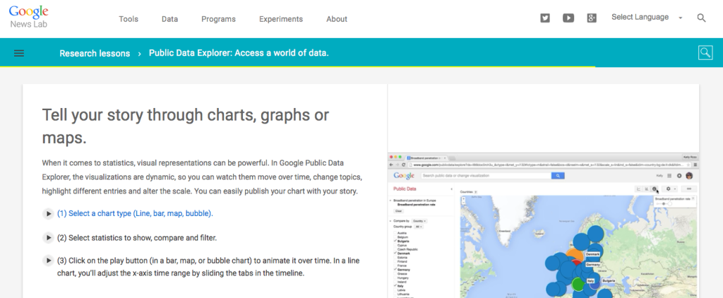
Google Media Tools, now called Google News Lab, is a REALLY interesting collection of tools that can assist journalists with finding and portraying data. I touched on this in my EWIP article—some very cool tools! We’re hoping to interview a member of its media outreach team to give you an inside look at these tools in the near future.
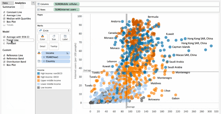
In her article Pictures Make Sense of Big Data, Deborah Gage explains how visualization technology can turn data into pictures that are far more comprehensible. She reviews a number of interesting tools, with one of the most intriguing being Tableau Software. Tableau Software allows you to analyze your data on the fly, and offers some useful tutorials and tools that you can try for free! (And no, we don’t get a kickback—we just think it’s cool.)
Some folks think the age of infographics is over (can you believe that?), but with the ever increasing volume and availability of data that can help us tell stories in new and deeper ways, effective data visualization is one of the next major challenges and disruptors for the content industry. We can’t wait to see where this goes next!
CEO Margot Knorr Mancini’s monthly blog on Content Strategy shares valuable insights and observations from her experiences in the publishing industry.
Check out her other articles in our Content Strategy section. Sign up for TFP’s other newsletter briefings, including Media Metrics and This Week in Publishing, which highlights our weekly picks along with industry news and tips to help you stay informed. Have a suggestion for a topic you’d like to know more about? Drop us a note!
Posted by: Margot Knorr Mancini


