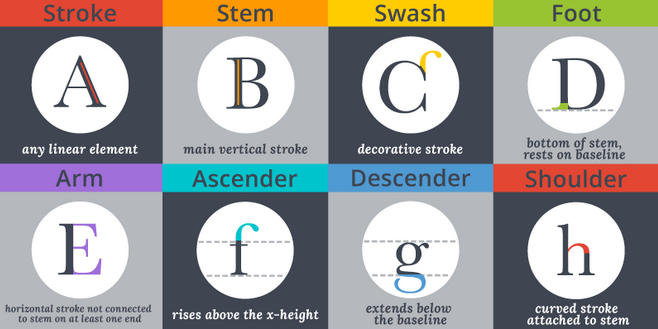
Serifs, strokes, and swashes. This week’s infographic pick, posted by Janie Klieve on Canva, takes us into the world of typography with an illustrated overview of everything from typeface categories and styles to positioning and spacing to the parts of letters.
If you’re a designer, this colorful glossary is a great review of terms you’re likely familiar with. If you’re a layperson, it opens the door to typography basics, helping you understand how fonts are chosen and applied in design projects.
Check out the full infographic The Anatomy of Typography—you’ll seem pretty smart when you explain to your colleagues the difference between a font and a typeface!
Want to see more infographics? Check out our blog and sign up for TFP’s This Week in Publishing newsletter, which highlights our weekly industry news picks and tips to help you stay informed. Have you seen an infographic out there that you think we should include? Drop us a note!
Posted by: Margot Knorr Mancini


