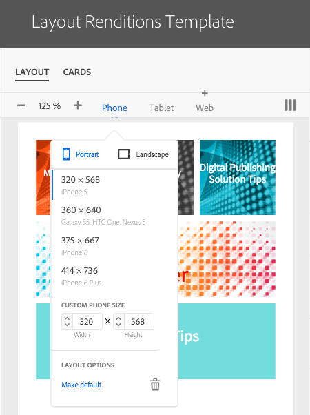
These days most people read digital content on multiple devices. Being able to design content for multiple target devices can be done with the AEM Mobile layout renditions feature. Renditions of a browse page for the same collection can be created for use on tablets, phones, and the Desktop Web Viewer using different layout and card settings. The settings for each target device will determine the appearance of the browse page.
Create Layout Template with Renditions
- Create a new layout template or open an existing tablet layout template. This will be the default layout template upon which the renditions will be based.
- Choose settings for this default layout template that can apply to all target devices. This will cut down on the need to edit the same settings multiple times for each rendition.
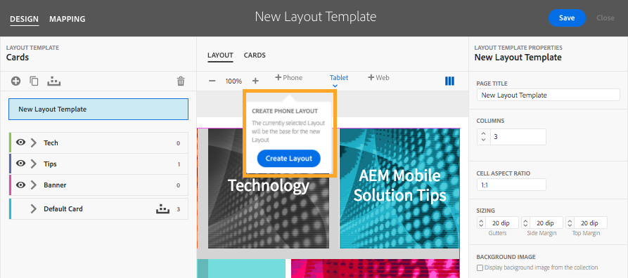
Note: When new renditions are created, they inherit the settings from the default tablet rendition. However, changes made after that will apply only to the renditions in which the changes are made. Card mapping rules and any changes made are applied to all renditions. - Create a phone layout rendition. Select Phone and then click the Add Layout button.
- Click Create Layout.
- With Phone selected, modify card and layout settings to work specifically in a phone browse page.
- Use the device menu to choose different devices to preview.
- Save the Layout and assign it to an imported collection or to an existing collection.

Additional Layout Rendition Notes
- To delete a layout rendition, select the device and click the trash can icon at the bottom of the device menu. Note: There is no warning message when you click the icon.
- To use a layout rendition other than the tablet layout rendition as the default, select the device and choose Make Default at the bottom of the device menu.
- Layout renditions will be listed with each layout template. The image below shows two renditions, tablet and phone.
Get our infographic How Adobe Experience Manager Mobile Works for a visual reference guide to creating AEM Mobile apps, organizing content, and much more!
For weekly tips and updates on Adobe Experience Manager Mobile and InDesign, check out our blog and sign up for our newsletters. Want to learn even more and become an InDesign or AEM Mobile expert? Check out all our best-selling handbooks and apps.
Note: Information contained in this post is current at the time of posting. Visit the Technology for Publishing News & Events blog for the latest info on Adobe software releases and functionality.
Posted by: Monica Murphy


