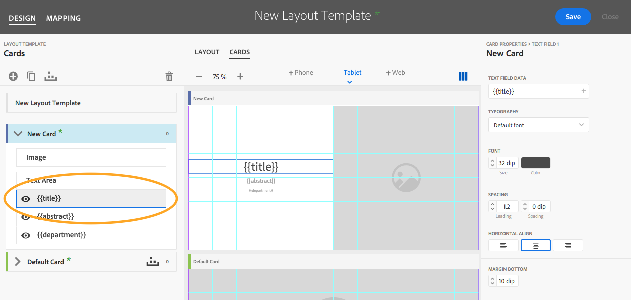
After the layout properties are added to the Layout Template, as described in our previous tip, the next step is to further define how content will be displayed in your app. Cards are used to display collections, articles, and banners, and are arranged in the layouts according to Card Mapping Rules. See the steps below to create both.
Create Cards
- Select the Design tab and then the Cards tab. Click on the plus sign icon to open the card format options.
- Select a Card Format from the drop-down list. Available format options include: No Image, Full Image, Image Top, Image Right, Image Left.
Note: The card format can be changed after the card is created in the card properties panel.

- Define the card properties:
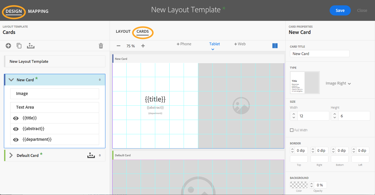
Card Title This refers to the name used to reference the card within AEM Mobile.
Card Format The format previously selected is shown or can be changed by selecting a different format from the drop-down menu.
Card Width Specify the number of columns the card should span on the layout. This is a required field.
Card Height Specify the number of rows the card should span on the layout. This is a required field.
Full Width Select to fill width without the need to input the number of columns. - Select Image from the list (circled below) or click on the image box in the preview area. Define the image properties:
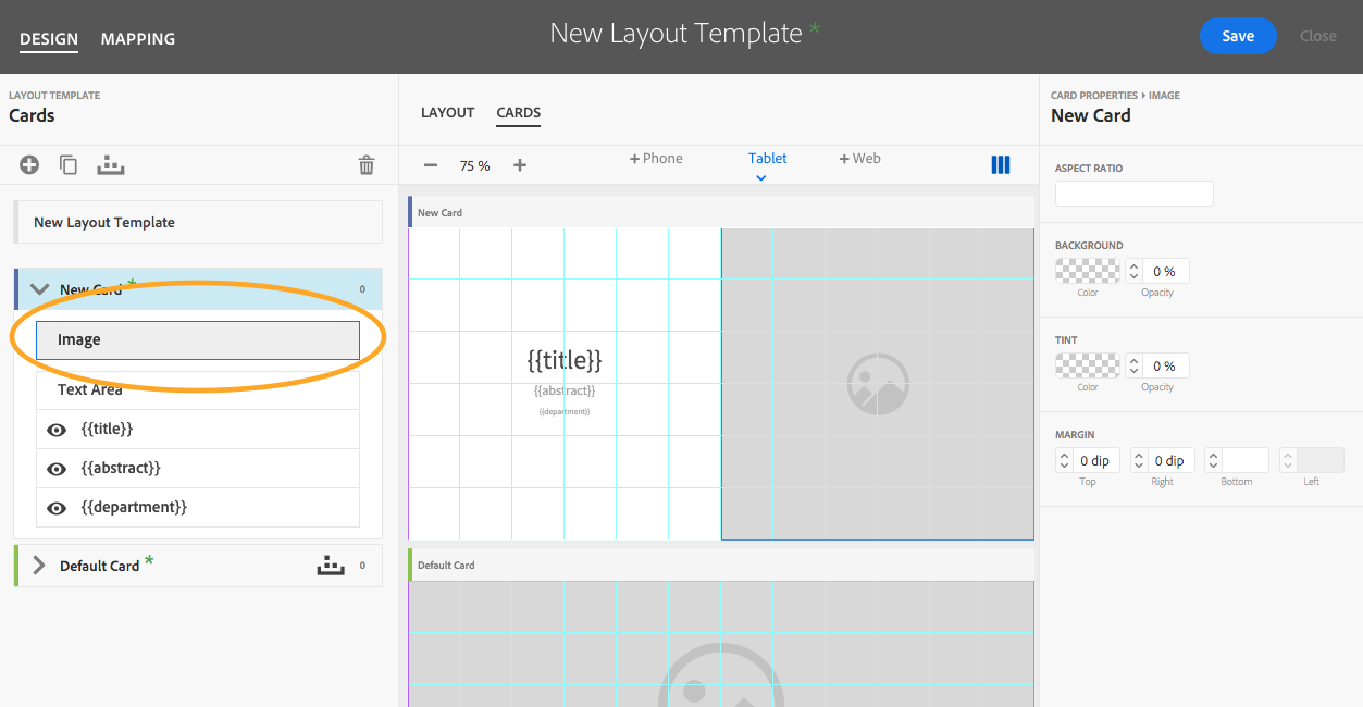
Aspect Ratio This defines the aspect ratio of the image in relation to the size of the card in columns and rows. This can be a ratio or a whole number.
Background Enter a background color (hex) and its opacity (%).
Tint Set values for a color overlay (hex) and its opacity (%).
Margins Enter values to move the image away from the edge of the card for the top, bottom, left, or right in DIP. - Select Text Area or click on the text box in the preview area. Define the text area properties:
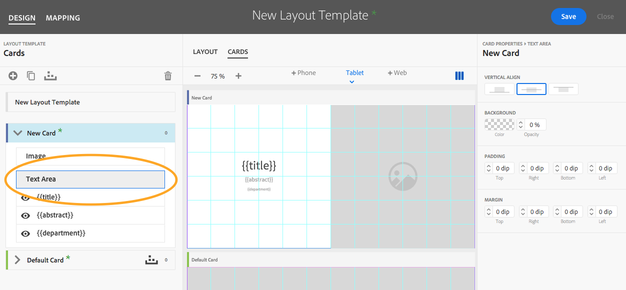
Vertical Align Choose to align the text to the bottom, middle, or top of the text area.
Background Enter a background color (hex) and its opacity (%).
Padding Enter values to move text away from the edge of the text area for top, right, bottom, or left in DIP.
Margin Enter values to move text away from the edge of the card for top, right, bottom, or left in DIP. - Select each Text Field or click on the text field in the preview area. Define the text field properties. Note: Click the Hide icon next to a metadata field to disable it from the card design.
Text Field Data The selected metadata field is shown. Click the plus sign to change or add additional metadata. Type can be added to the text field data, for example: by {{author}}. (Repeat steps for each metadata field in card design.)
Typography Select a font face from the drop-down list of those added in the Font section of the AEM Mobile Portal.
Font Size Enter the font size in DIP.
Font Color Enter the font color (hex).
Leading Enter the font leading in DIP.
Spacing Enter a font tracking value in DIP.
Horizontal Align Choose from left, center, or right text alignment.
Margin Bottom Enter a space after value in DIP.
Create Card Mapping Rules
- Select the Mapping tab. Choose either Layout or Cards to change what will be previewed while settings are changed.
Note: A red error triangle may appear next to a collection name until the layout template is saved and assigned to the collection. - Choose a card and click the expand arrow. Click Add Rule.
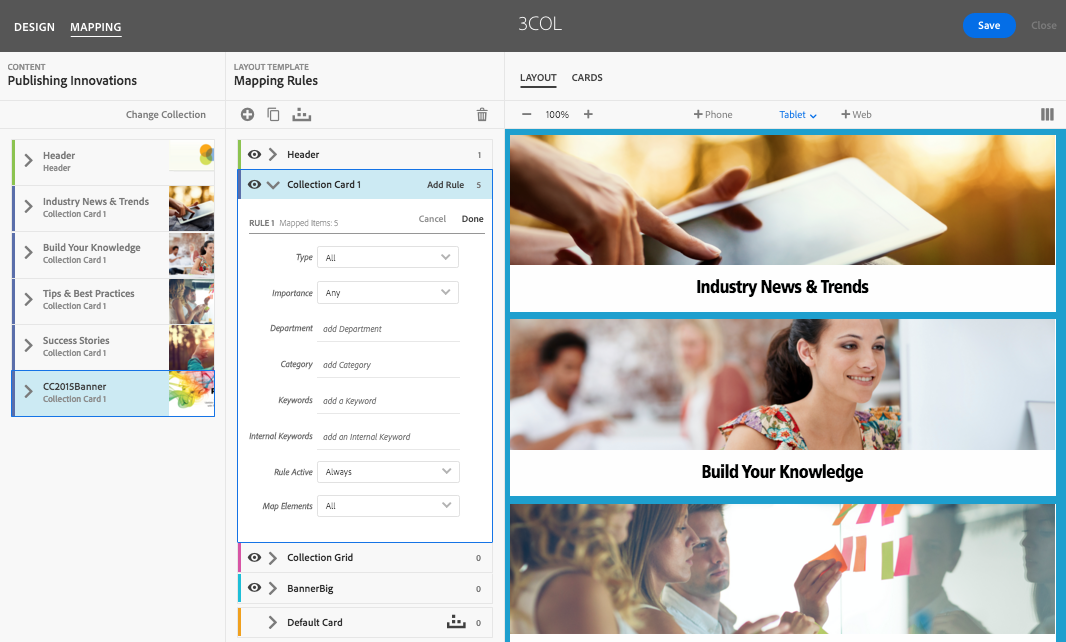
- Define the mapping properties by choosing the metadata filters that determine what cards will be used in the layout. The preview window will show which collection content that is assigned to the cards as the mapping rules are created. Note: The filters displayed will change depending on the content type selected in the first field. Metadata filters include:
Type Choose from All, Articles, Collections, or Banners.
Importance Choose from Any, High, Normal, or Low.
Article Access Choose from Any, Fee, Metered, or Protected.
Advertisement Choose from Any, Ads, or Non-Ads.
Department and Category Enter the name of a department and/or category used in content and collection properties.
Keywords and Internal Keywords Enter keywords and/or internal keywords separated by commas added in content and collection properties.
Rule Active Applies a card only to the specified number of items that match the criteria if “Sometimes” is chosen from the drop-down menu. “Always” is the default.
Map Elements Applies a card for every “nth” card that matches the criteria if “Some” is chosen from the drop-down menu. “All” is the default.
Note: It is important to remember that all metadata that is entered is case-sensitive and the mapping rule only needs to match one of the keywords. - Save the layout template.
Get our infographic How Adobe Experience Manager Mobile Works for a visual reference guide to creating AEM Mobile apps, organizing content, and much more!
For weekly tips and updates on Adobe Experience Manager Mobile and InDesign, check out our blog and sign up for our newsletters. Want to learn even more and become an InDesign or AEM Mobile expert? Check out all our best-selling handbooks and apps.
Note: Information contained in this post is current at the time of posting. Visit the Technology for Publishing News & Events blog for the latest info on Adobe software releases and functionality.
Posted by: Monica Murphy


