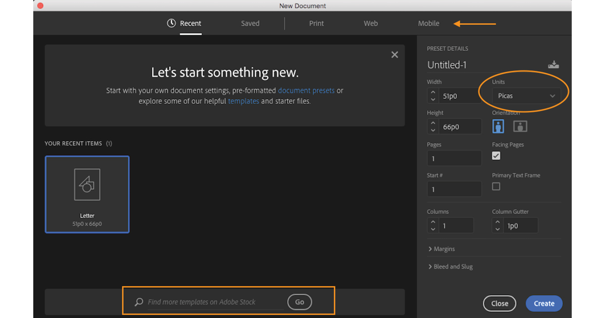
The redesigned New Document dialog provides a look that’s more consistent with those of Illustrator and Photoshop. Adobe’s effort to create consistency and decrease eye strain has been going on for some time, starting with changes to the color theme and size, spacing, and flattening of elements in application windows and dialogs. Let’s hope this is the final design.
The New Document dialog also makes prefab templates readily available. When creating a new document, you have the option to choose the Print, Web, or Mobile tab at the top of the dialog and then select an Adobe Stock template from the samples shown or search for other templates on the Adobe Stock website. Templates can be downloaded and further customized for your needs. Additionally, the Intent drop-down menu and the Preview checkbox have been removed, and an option to set the measurement system for your document has been added.
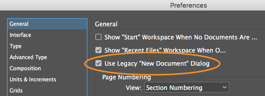
As a footnote to the introduction of this redesigned dialog, there is a new option in General Preferences for users who prefer the old New Document dialog.
Check out our handbook, Using Adobe InDesign CC 2017, for more features!
For weekly tips and updates on Adobe Experience Manager Mobile and InDesign, check out our blog and sign up for our newsletters. Want to learn even more and become an InDesign or AEM Mobile expert? Check out all our best-selling handbooks and apps.
Note: Information contained in this post is current at the time of posting. Visit the Technology for Publishing News & Events blog for the latest info on Adobe software releases and functionality.
Posted by: Monica Murphy


