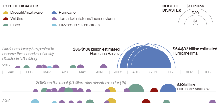
See the extreme National Geographic recently provided a great example of how to do data visualization right with an infographic charting the rise of billion-dollar weather events like Hurricanes Harvey and Irma.
With event icons laid out across timelines for each year in the sample, color-coded by type and sized according to their cost, viewers can easily see which disasters stand out in each year and in which months they happened, and compare results across years.
For a valuable lesson in how to make complex data relevant and understandable, check out the full infographic Billion-Dollar Weather on NatGeo’s site.
Visit our blog to see more infographics, and sign up for TFP’s This Week in Publishing newsletter, which highlights our weekly industry news picks and tips to help you stay informed. Have you seen an infographic out there that you think we should include? Drop us a note!
Posted by: Margot Knorr Mancini


