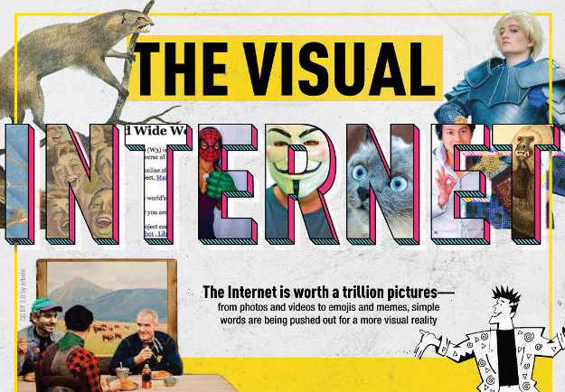
Every picture tells a story
It goes without saying that visuals are key in digital publishing, but just slapping any ol’ image above your text doesn’t cut it in today’s attention-challenged world.
As this week’s infographic pick from FramesDirect shows, there are a number of things to keep in mind when deciding how to use visuals in your web content. For one, digital readers scan rather than read pages, and it takes only 13 milliseconds to process an image—meaning your choice of visuals needs to be engaging or your readers will be quickly on to the next thing. Also, web readers scan in an “F” pattern, something you need to consider when placing your images.
For more on optimizing your visual content—as well as a cool timeline of the evolution of the visual Internet—see the full infographic The Visual Internet on Marketing Profs’ site.
Visit our blog to see more infographics, and sign up for TFP’s This Week in Publishing newsletter, which highlights our weekly industry news picks and tips to help you stay informed. Have you seen an infographic out there that you think we should include? Drop us a note!
Posted by: Margot Knorr Mancini


