INFOGRAPHIC PICK: How NatGeo Does Data Visualization

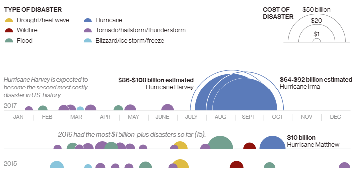
See the extreme National Geographic recently provided a great example of how to do data visualization right with an infographic charting the rise of billion-dollar weather events like Hurricanes Harvey and Irma. With event icons laid out across timelines for each ...
READ MORE

