It’s different from our typical infographic picks, but earth.nullschool.net is really cool—plus it might inspire you to expand your notion of what’s possible in journalism when it comes to data visualization.
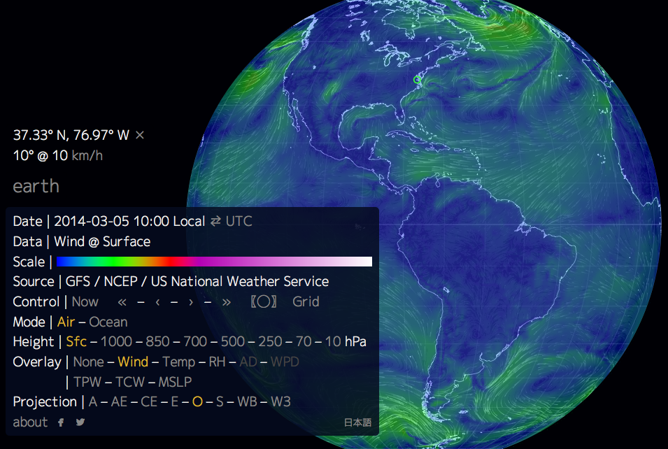
Web developer Cameron Beccario has created an interactive animated map of worldwide weather patterns that’s updated every three hours based on data from the Global Forecast System. As an article from Slate explains, “You can spin the map like a globe, zoom in on a particular region, or just soak in the oddly soothing sight of the neon lines steadily making their way across the globe.”
Click anywhere on the globe to select a specific location, then click on the “earth” menu in the bottom left corner to reveal detailed weather-related data and visual overlay options.
Click the image below to take earth.nullschool.net for a spin yourself!
Visit Technology for Publishing‘s blog each week for interesting and informative media-related infographics we’ve discovered and want to share. Have you seen one out there that you think we should include? Drop us a note!
Posted by: Margot Knorr Mancini
